Hello, Wallapop
eBay is leaving the occasional, unsophisticated seller behind. wallapop has timely captured the niche with a laser-focused, mobile-first experience that makes of second-hand marketplaces a pure delight.
🙋♂️ This is the second part of a two-post story around peer-to-peer, second-hand marketplaces — here you can find the first part of the story, make sure you read that one first!
wallapop has grown to be the poster child of Spanish startups. At its core, it is a second-hand marketplace, but beyond its “market label”, wallapop’s product has truly understood the problem it is aiming to solve, way before rashly jumping into a given solution.
Second-hand marketplaces aren’t new phenomena. It is already crowded with dozens of players, but as I noted in the previous post, this doesn’t mean the problem has been properly solved.
The opportunity in the space is not novel and has always been both interesting and obvious for companies trying to take a cut out of people willingness to buy and sell stuff.
Yet the fact that it was so “obvious” tied the platforms creations early in the desktop era of computing — mainly because back then mobile hasn’t even entered the picture. Inevitably, as new means of interaction (like mobile) emerged, they opened up the opportunity for entirely new, more optimized experiences to be created around it.
And while most legacy products born in the desktop era have already released their mobile version in order to remain competitive in the space, most of them still carry around a lot of weight from the web 1.0. They are just minified experiences of their desktop product, not something designed from the ground up with the mobile assumption in mind.
wallapop is clearly an exception to this trend. They have no desktop app. Its first product is a mobile app, thus it was born with no strings attached to the past. The product feels like it has been designed not just to be mobile-friendly, but mobile-only.
It sports its own personality but also has shamelessly cleverly borrowed some patterns and cues from well-established apps (such as Instagram or Pinterest). They’ve ultimately bundled it together to make a great mobile experience out of buying and selling stuff.
The next sections will discuss several aspects of the wallapop experience and product design choices, using the previous post as a reference.
Publisher tools
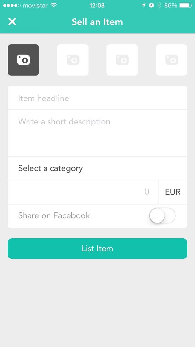
In just four easy steps. Instead of the endless form, you were presented in eBay’s page wallapop features a simple four-step approach to publish an article.
- Take a few pictures: each smartphone happens to have a built-in camera, how come you aren’t we using it? Upload the pictures you just took right from the smartphone and the rest of the job is done behind the scenes. Compare this with the old (flash-based, really) eBay uploader and both friction and time it takes to upload the pictures is dramatically reduced.
- Enter a title and a short description: this is a clear example of how a deliberately constrained design leads to a more focused and cohesive experience. Browsing on eBay you’ll rapidly notice huge design inconsistencies across listings, all featuring ugly fonts and confusing information. wallapop has taken the opposite approach: plain text and ridiculously small editor. It forces you to be brief and concise, while it gives a cohesive look across all listings.
- Set the price: just type a number and it’s done. eBay’s fields instead are crowded with drop downs, payment methods, types of auction, when to publish… it’s a mess compared to wallapop’s simplicity.
- Choose a category: from just eight, plain and simple. Think about what people have to sell, almost all listings will fall into one of those categories — it is 80/20 at its best. And if it doesn’t, hit “Other” and get over it.
Finally, hit “Publish” and you’re done. This is as easy as it gets. The form is obviously not as feature rich as eBay’s, but that’s the point. If you miss any of those features, wallapop might not be the right tool for you. wallapop has definitely followed the classic startup playbook: design and build something that appeals to a narrow, underserved segment of users (this is individuals looking for selling their unused stuff), optimize for them, solve their problem like no other can, and from there, grow by capturing adjacent channels.
Discoverability
The same way publishing has been designed around individuals and occasional sellers, discovery has also been optimized with a mobile experience in mind.
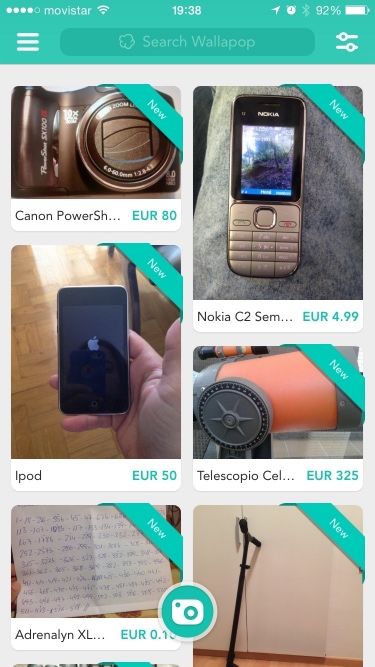
To begin with, the feed is the default view when you launch the app. It reveals Pinterest-like navigation with a handy filter at the top that shows you available items ranked by proximity to your current location. This is not just a clever way to leverage mobile-only capabilities, such as GPS. It also honors the screen real estate by presenting a few items at once, while it increases the chances of closing a deal because you can presume the seller is not far away from you.
Leveraging location and the card-like infinite scroll (with huge pictures and clear fonts) are proven patterns that induce the user to keep scrolling and engaging with the content. It tricks your mind and succeeds at recreating the anxiety illusion that you might be just one scroll away from the desired item you are looking for.
This kind of navigation and interaction pattern is by wallapop’s founding principles. As obvious as ranking items by proximity might sound, the designers behind the product could only make such delivered decisions because they assumed a mobile device was at hand.
On the other hand, if you know what you’re looking for in advance, you can type directly in the search box or use the filters to limit your scope. A wide range of filters is available, such as price, category, accepts-trades and many other useful dimensions. The UI for the “fine tuning” is well presented, but it is deliberately hidden under the top right button — clearly aimed to advanced users.
Identity
Up to this point, all the features presented were relevant in order to craft a great experience. Yet this one is especially relevant today because online trust is the foundation of the modern web. Nicknames were huge in the 90s, but as the Internet has become more social you want to know who you are dealing with.
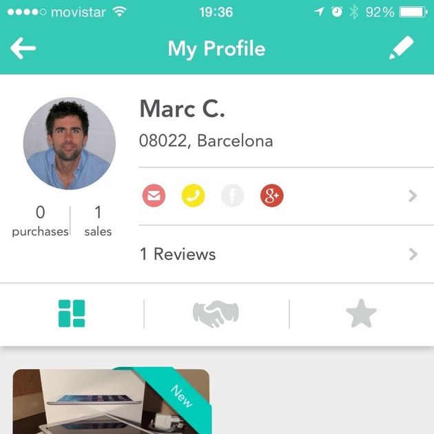
When you install the app, the first thing you are encouraged to do is verify your phone and link your social profiles in order to show the world that you are a real human.
The profile is accessible and straightforward. In a glance, you can see all the reviews from the user, what she’s bought or sold and all the deals she’s made. It doesn’t sport fancy metrics, it goes to the point — the information you need to know.
It shows designers have deeply thought and asked themselves what a user (both a buyer or a seller) wants to know when entering a negotiation. Because wallapop’s deals are closed in-person, the “meeting-barrier” can be daunting for some. Having a clear picture of who you’ll be meeting with, derisks the feeling and creates a sense of confidence that, ultimately, smooth transactions.
Talk instead of bid
We are entering into delight territory here. wallapop did plenty of things right, but the fundamental thing they understood is that the experience should revolve around a human conversation, rather than the item itself.
This is a critical shift in how the service works because it flips the foundation of a marketplace in its head.
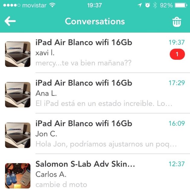
Texting is the thing. It is unobtrusive — at least to a certain extent — direct and built right into our very nature. wallapop has turned the chat into the buying experience itself. The CTA is not “buy” or “bid”, but to “talk” instead, and it is brilliant.
Same with the location, because of the narrowed focus nature of the service, wallapop could make assumptions that eBay could not. wallapop could assume their users would not be huge stores, with thousands SKUs, thus conversations could be managed at a small scale.
It is a clear example of how a constraint turned out to be an asset when it came to making a product decision. Chat becomes the simplest and easiest way to communicate between parties and to put it in analog terms, the service resembles more a Bazaar in Marrakech than a Walmart mall.
The chat is, of course, private — it doesn’t expose you to read receipts and also has built-in useful functionalities like a counteroffer. The experience of chatting with the seller is unmatchable because it gives an illusion of proximity to both parties and that, again, reinforces trust between them.
Pricing
For now, wallapop doesn’t charge you for any transaction. They even reinforce the idea of exchanging in-person instead of closing deals through the app (which is a place where they could monetize the success of the transaction). They don’t even hide it, on the contrary, the “in-person exchange” is being exposed as a “feature” and core to the experience.
This idea feels diametrically opposite to eBay’s foundation of anonymity, disconnection between parties, ultimately rooted in the “old Internet”.
Yet like it or not, eBay’s nature is also what enables its business model. The end-to-end control of the transaction makes it easier to create friction, own distribution and ultimately, monetize.
On the other hand, wallapop’s nature encourages its users to pay in cash, rendering the “take a cut” option virtually impossible. At this time this might not be a concern for wallapop since their focus is on growth and the only way to get there is by offering a free service. Yet we should be aware that this situation might have an expiration date, and at some point, they ought to figure out how to make money.
A better experience
wallapop is taking on a large problem, but it has done so by first narrowing down and focusing on a niche. And despite its initial market has been subsequently reduced, I’d argue that’s a good thing. It might not appeal to everybody, but that’s the point of their focused strategy. The service is leveraging these constraints to enhance the experience and optimize for their selected users.
The exchange feels personal, more connected, and that builds trust, the foundation of a peer-to-peer sale.
On top of that, wallapop has also externalized to the users almost all the friction points, such as payments or delivery — a trade-off most users embrace since it enables the power of a free service. This also works in the benefit of wallapop, because it unlocks growths and helps build a huge user base.
In a nutshell, the mobile-first experience of selling a product at wallapop is unmatchable and it is no wonder how much traction the platform has gotten in such a brief period of time. It is ultimately a great lesson of how understanding the problem first, and only then delivering a thoughtful solution, always leads to the best products.


